
My 3 Favorite Websites & Why Visual Design is More Important Than Ever
Mashable.com is one of my top 3 websites for visual design and usability
As connection speed and display quality increase, so too does the importance of good visual design
When I visit a website, there are 3 main things that I look for that will very quickly determine whether or not I will stay on that site.
- How easy is it to find whatever I am looking for?
- How easy is it to figure out what I should do next?
- Is there anything about the site that is interesting enough to keep me around?
At first glance, based on my criteria, it might seem like the visual design of the site isn't very important. After all, I didn't list the visual design of the site in my main criteria.
Quite the contrary, of course. In reality, the visual design of the site is crucial in all 3 of the criteria I listed above. Graphic designers agonize over all sorts of decisions in the creative/design process to create a design which has purpose, can communicate exactly the message the site is intended to communicate, can help lead a users eyes toward the very thing they are looking for and also create a pleasing mood which reinforces a users desire to stay on the site.
Good design is not just about making a site look pretty. In fact, the most important factor in creating a good design is to create a site that performs it's function first. The visually appealing images, colors and textures good designers use often stand out and catch the eye of the viewer, but they are often simply they icing on the cake from the designers point of view.
That is to say that a good designer is most interested with the entire experience of the visitor. It's not enough to just have eye popping images or a visually appealing site. Can a visitor actually navigate the site without having to guess where the next item they are looking for is located? Are there too many options which can cause paralysis? If there is a lot of copy, is it readable? Are there enough visual breaks in the copy to hold a visitor's interest? etc...
Good developers should keep these things in mind as well while they develop their sites. It might be beneficial for the developer to think of the visual design of the site in the same way that they think about breaking down a problem to write code for it. It is actually a very similar process.
Designers try to pair down a problem and remove as many elements that are not important to the main message as is possible. A good visual design, in fact, is made up of only as many elements as is needed to communicate the main message. This process is identical to the process that developers use when solving a programming challenge.
Content, of course, is just as crucial as the visual design of the site, but a good visual design will help your site draw more visitors, help to satisfy your visitors while keeping them in a positive state of mine, and help keep them around longer.
My 3 Favorites
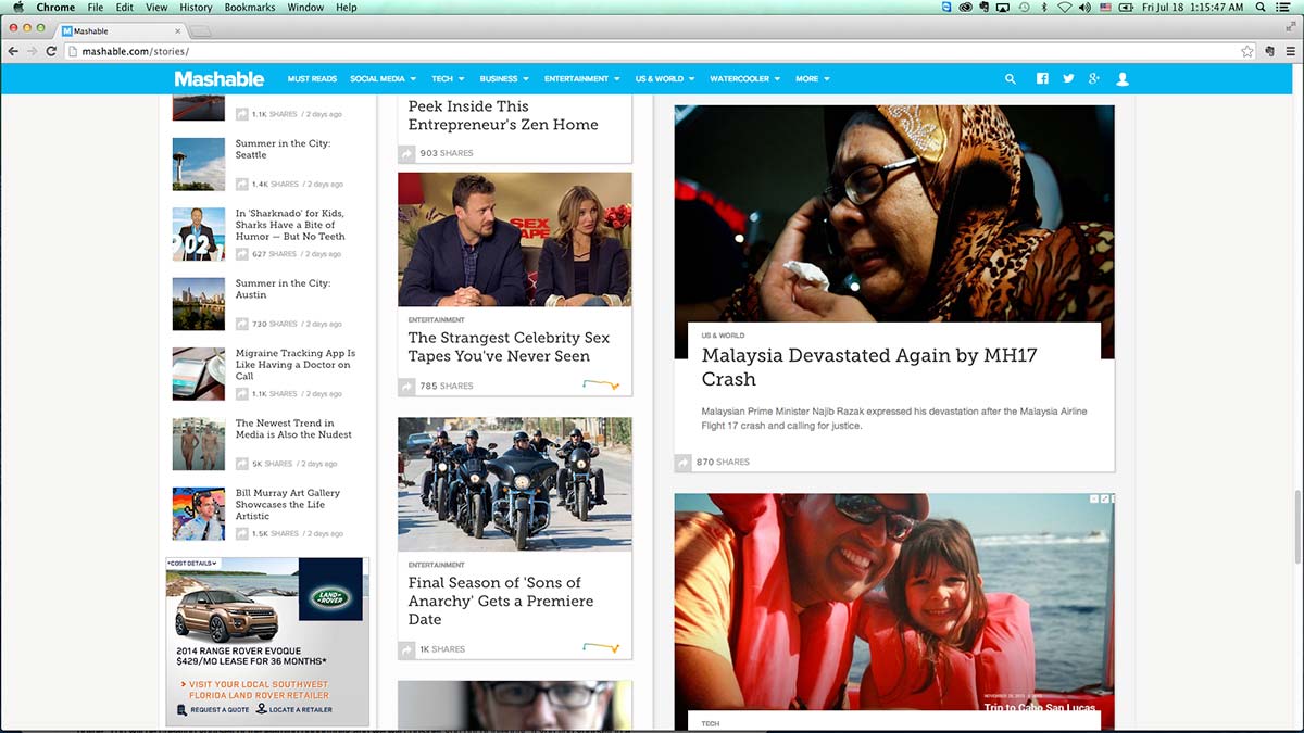
Mashable.com
Mashable's site has 3 columns with lots of pics
By doing this, they reassure you that you are in the right place and they take care of branding right off the bat. I would really love to see the stats for this site. I have to believe that most people click on the top right story more often than not.
What does your eye see next? Most likely it's the ad right below the main story. They've used "white space" to draw your eye to it. This is a great example of how a designer can lead a viewers eyes right where they want them to go. Of course, at some point you probably glanced at the banner ad up top for a moment too as it is the only other element surrounded by "white space"
Whenever I get done reading a story on Mashable, I usually go right back to the home page and start browsing. I absolutely love to browse on this site. There are three different sizes of columns. I can browse quickly through smaller stories on the left and the thumbnails help me decide quickly if I might be interested in a story. Every once in a while I glance back to make sure I don't miss any to the right.
Writing this post has made me realize that I very rarely use the navigation at the top of the page. It's there though, and it's effective. There is a lot going on on this site and many ways to find information that you are looking for. I don't tend to go to Mashable just to browse, it's usually because I've seen a story on Linked-in or Twitter and clicked on it. Once I get into the Mashable site, I tend to stay for awhile and browse. That's the sign of a really good website.
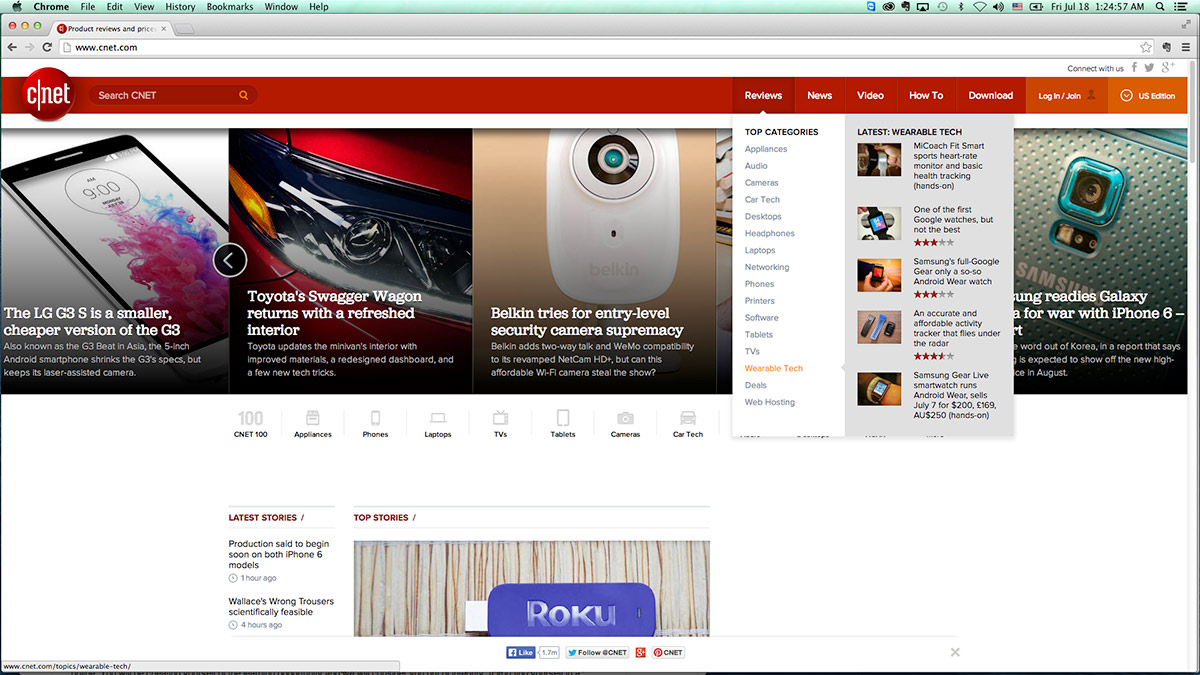
c|net.com
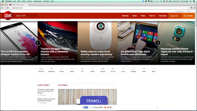
c|net is another tech site with lots of images and a sleek design
I really like the slider on this page. It's different. I'm sick of seeing one narrow image accross the top. Everyone is doing that, and it's not that great in most cases unless you have the right panoramic shot to use. Ask any photographer or art major and they'll tell you the truth. It's called the "Golden Section" for a reason. We should get back to using pictures in the right proportions.
Back to c|net here, I love the fact that I can browse quickly and use the images to help me decide which articles I might be intersted in checking out. Once again, just like Mashable, there is a very smartly designed menu at the top of the page which is completely out of the way and yet hold a treasure trove of options. I love it!
My experience with c|net is almost identical to that of Mashable. I tend to end up here because I saw some story that someone I knew had tweeted about. It caught my eye and I ended up on c|net. Before I know it, I've read three different articles on c|net and I've uploaded 5 more to Evernote so that I can read them when I have time.
Kudos to c|net and Mashable
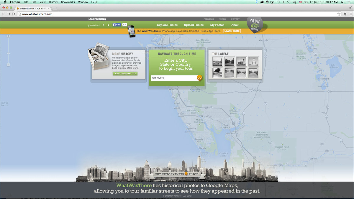
WhatWasThere.com
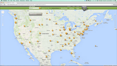
WhatWasThere.com looks really cool.
It's beautiful and simple at the same time. The best solutions are usually simple, and this, in turn, makes them beautiful. When you visit this site, you can't help but want to type in your city and hit "Go." The designer has used many techniques here to draw your eye right to the middle. It's obvious what the next step is and I didn't even think twice about typing in my city.
On most websites, even good ones, there are usually way to many options. If you want someone to click "Go" then lead them to it and don't give them another button that says "Start." This leads to confusion and paralysis. There is no chance of this on WhatWasThere.com. You're going to type your city in that box and hit "Go" and you're going to like it!
I also love the details here. They've used muted colors on the map and grayscale at the bottom, so the Green and Orange pop off the page at you. There is one thing that really concerns me about this site however. They have completely blown it in one of the most important areas of website design. There is absolutely no branding going on here. They don't have a logo and they've put what looks like it might be a logo in the wrong place. I'm all for breaking rules when there is a good reason. I don't think that putting a login/register link in place of your logo is a good idea.
I still think they've done a great job with this site though, and if they fix their logo situation they might move further up my list.