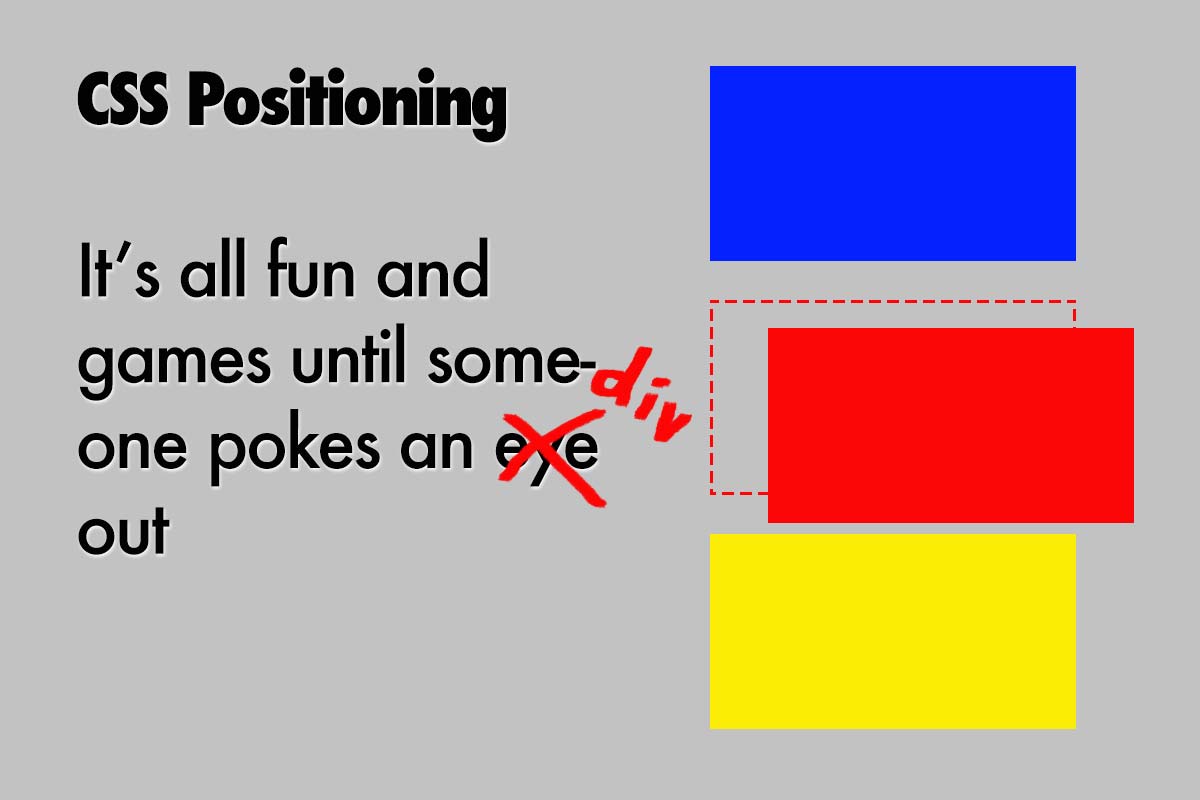
Fixing a div absolutely inside a relatively positioned element

One of the least understood aspects of CSS for the beginning Web Designer is positioning of elements.
Learn when and how to use Static, Relative, Absolute and Fixed Positioning effectively
If you are a beginner or intermediate level Web Designer and you are terrified of the position rule in CSS, rest assured that you are not alone. With only four possible values - Static, Relative, Absolute, and Fixed - at first glance it seems like it would be easy to learn. In reality, this is the one rule that frustrates both beginners and seasoned veterans on a regular basis.
Why is it so difficult to pick up? Well, I think it's just advanced enough that many beginning designers haven't made it to the point where they need to tackle it yet. On the other hand, intermediate and advanced users find it very simple to use once they know how to use it.
Once they've learned, they often forget what they've learned because they don't use it for another month or so, and then they do a quick Google search to refresh their memory.
There isn't enough demand for quality resources to teach it, and so everyone just gravitates to a few sites to learn it and there aren't many new sites that take up the issue, so we never really see much diversity in the way the information is presented.
I'm going to attempt to put it all together here in one place so that, hopefully you will have a good reference where you can quickly find the exact info you need on the subject. Here goes:
First of all, it is important to understand why and when to use each positioning value:
- Static:
- This is the default value for position:
- You do not need to designate this in CSS unless you need to change an elements position value as it has been set to relative, absolute or fixed previously such as with the use of Media Queries.
- Relative:
- Use if you want to position this element in relation to it's original position in the document.
- You may use this to designate this element to use positioning on a child element. In other words, you may use position: relative; on a div and then position another element which lives inside that div in relation to the designated div. More on this in a few minutes.
- Absolute:
- Use this to position an element in relation to a previously designated element.
- If no other parent element is designated with position: relative; then you can position in relation to the viewport itself.
- Fixed:
- This element will be positioned with respect to the viewport and will remain in that position permanently even when the rest of the page scrolls.
- This is often used for a menu bar at the top of the screen.
- Remember to pay attention to the z-axis attribute in CSS when using this. I usually designate a z-axis of 10 or higher for a menu bar to stay above certain items such as embedded You-Tube videos.
Examples
Now that you have a basic understanding of when and why to use the different values for position: let's take a look at some code examples:
your-page.html -- your-site.com
<div class="red"></div>
</div>
<div class="parent-static">
<div class="blue"></div>
</div>
<div class="parent-relative">
<div class="blue"></div>
</div>
<div class="parent-static">
<div class="yellow"></div>
</div>
<div class="parent-relative">
<div class="yellow"></div>
</div>
<div class="parent-static">
<div class="green"></div>
</div>
<div class="parent-relative">
<div class="green"></div>
</div>
margin: 10px;
width: 150px;
height: 100px;
background-color: LightGray;
}
.parent-relative {
margin: 10px;
position: relative;
width: 150px;
height: 100px;
background-color: DimGray;
}
.red {
position: static;
width: 50px;
height: 50px;
background-color: red;
}
.blue {
position: relative;
top: 10px;
left: 30px;
width: 50px;
height: 50px;
background-color: blue;
}
.yellow {
position: absolute;
bottom: 30px;
left: 30px;
width: 50px;
height: 50px;
background-color: yellow;
}
.green {
position: fixed;
width: 50px;
height: 50px;
background-color: green;
bottom: 0;
right: 0;
z-index: 12;
}
Line yy, Column xx
Spaces: 4 HTML/CSS
Important Observations
In the example above we have seven examples. The first is the red div which is set to static and therefor it is not necessary to display more than one. It will always appear exactly where it is supposed to in the flow of the document. In this case in the upper left hand corner of it's parent div.
Blue divs
The next two divs are blue. The first has a parent div that is set to static and the second has it's parent div set to relative. Because the blue div is set to relative, it will always be positioned relative to where it would normally be positioned in the flow of the document. The purpose of the example is to show that the parent div's setting of relative has no effect on the blue div.
Yellow divs
Now we take a look at the yellow divs. Wait a minute where is the first yellow div? No, the layout isn't broken. We've set the parent div to static on the first one, so the yellow div is being positioned in reference to the first parent element that has a position of relative. In this case, the div that surrounds the code snippet is set to relative, so the yellow div is now being positioned in reference to the code snippet div. If this div were set to static instead of relative, then the yellow div would appear in the lower left hand corner of the browser window.
Green divs
Now for the green div. Well, there isn't much to see here, or is there? Note that both of the green divs are placed in the bottom right hand corner of the page one on top of the other. The green divs are position: fixed; and they will stay where we put them in reference to the viewport. Also note that the parent div's status of static or relative makes absolutely no difference in this example. Fixed elements are always positioned in reference to the viewport no matter how their parent elments are designated.
Let's do something EPIC!


